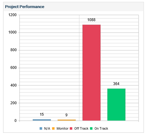
Project Progress
Project Progress widget displays the overall progress of projects in terms of on track, off track, monitor and not available.
You can view the progress as a ‘Bar Chart’ or ‘Doughnut Chart’. You can set a relevant view by clicking on the ‘Edit’ icon.
In the bar chart, the X axis displays the status (On Track, Off Track, Monitor, Not Available)
The Y Axis, indicates the percentage (or numbers, based on the selected filter options).
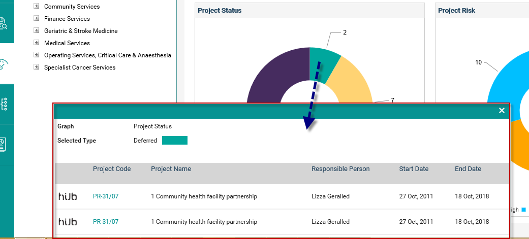
Click on a section of the widget to view more details.
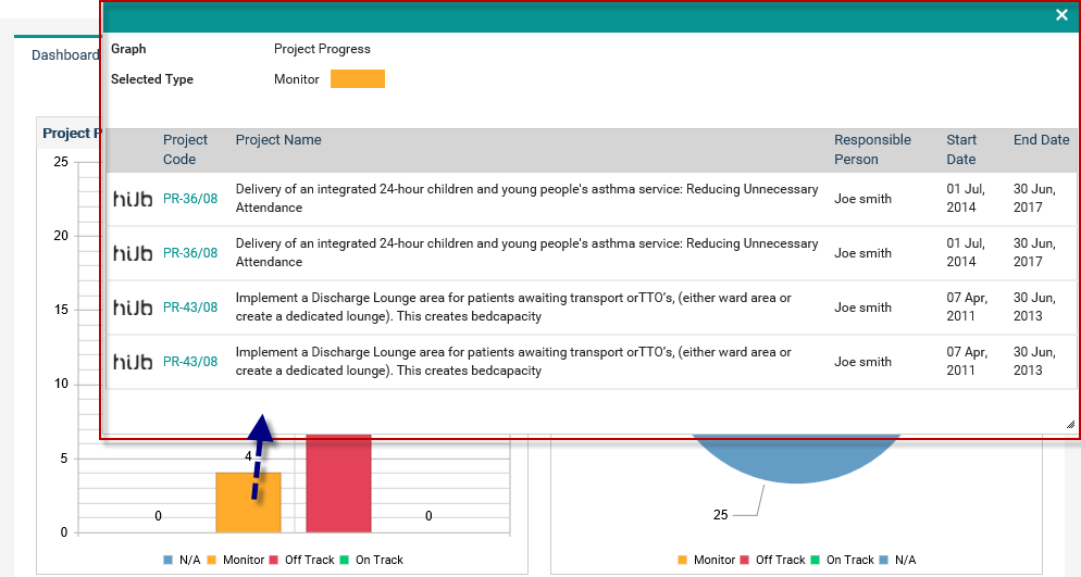
The details will be displayed in a grid as shown above.
The graph name and selected area details are mentioned above the grid.
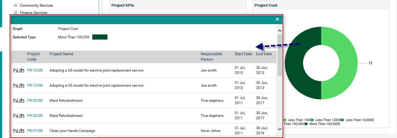
The Project Code is hyperlinked. Click on it to navigate to the project detail object within the workflow in a new tab.
Click on the ‘Hub’ icon stated against a project to navigate to the hub area in a new tab. You will be navigated to the default hub area, which is configured via My Settings.
Budget Performance
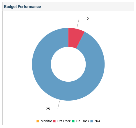
The budget performance widget displays the overall budget performance of projects.
You can view the budget performance as a ‘Bar Chart’ or ‘Doughnut Chart’. You can set a relevant view by clicking on the ‘Edit’ icon.
In the bar chart, the X axis displays the status (On Track, Off Track, Monitor, Not Available)
The Y Axis, indicates the percentage (or numbers, based on the selected filter options).
Budget performance of the project will be based on the implementation budget.
Click on a section of the widget to view more details. A grid will be displayed.
The graph name and selected area details are mentioned above the grid.
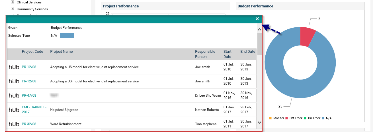
Project code is hyperlinked. Click on it to navigate to the project detail object within the workflow in a new tab.
Click on the ‘Hub’ icon stated against a project to navigate to the hub area in a new tab. You will be navigated to the default hub area, which is configured via My Settings.
Project Status
Project Status widget displays the projects categorised as per the Project Status.
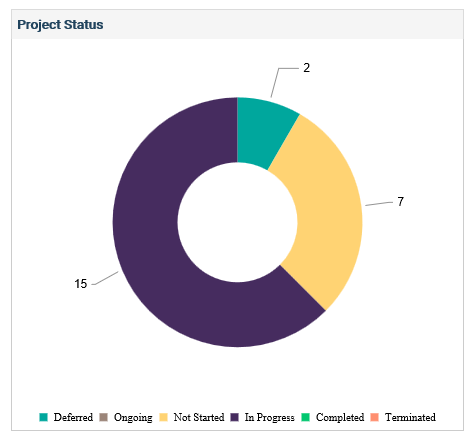
You can view the status as a ‘Bar Chart’ or ‘Doughnut Chart’. You can set a relevant view by clicking on the ‘Edit’ icon. By default it will be shown as a doughnut chart.
In the bar chart, the X axis displays the status (In Progress, Differed, Completed etc.)
The Y Axis, indicates the percentage (or numbers, based on the selected filter options).
The Status for the project is referred from the ‘Projected Status’ field in the ‘Project Details’ object.
Click a section of the widget to view more details. A grid will be displayed.
The graph name and selected area details are mentioned above the grid.
Project code is hyperlinked. Click on it navigate to the project detail object within the workflow in a new tab.
Click on the ‘Hub’ icon stated against a project to navigate to the hub area in a new tab. You will be navigated to the default hub area, which is configured via My Settings.
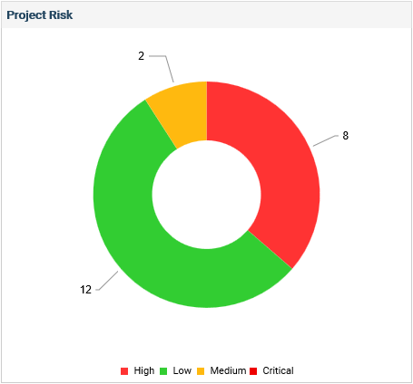
Project Risk
Project Risk widget displays the project risks (available in the Risk Assessment object) categorised as per the risk rating type
If a ‘Risk Assessment’ object is not available in any of the project workflows, then the message “Risk Assessment object is not configured in project workflows” will be displayed. The legend will be displayed if the colours are configured for the rating type (within the risk setting area).
If the ‘Risk Assessment’ object is available in the project workflow, however, there are no risks included in the ‘Risk Assessment’ object, then the message “There are no risks linked to projects” will be displayed.
The Project Risks are categorised as per their risk rating types in the Current Risk Assessment Level of the risk. Current risk assessment level of a risk will be derived as follows;
- If there are no risk assessments for the risk, then the current risk assessment will be Initial Risk Assessment.
- If there is a rating in the Initial Risk Assessment, then the current risk assessment will be Revised Risk Assessment.
- If there is a rating in the Future Risk Assessment, then the current risk assessment will be Future Risk Assessment.
Risks with no rating will be categorised under N/A section.
You can view the risks as a ‘Bar Chart’ or ‘Doughnut Chart’. You can set a relevant view by clicking on the ‘Edit’ icon. By default it will be shown as a doughnut chart.
In the bar chart, the X axis displays the Risk Rating Type (High, Moderate, Low etc.)
The Y Axis, indicates the percentage (or numbers, based on the selected filter options).
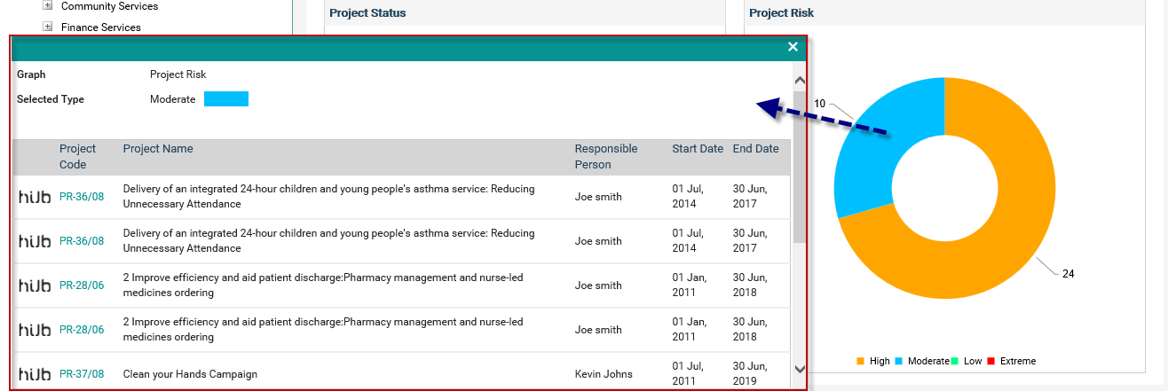
Click on a section of the widget to view more details (The projects categorised as per the risk rating type). A grid will be displayed. Selected graph name and section are displayed on top of the grid.
Project code is hyperlinked. Click on it to navigate to the project detail object within the workflow in a new tab.
Click on the ‘Hub’ icon stated against a project to navigate to the area in a new tab. You will be navigated to the default hub area, which is configured via My Settings.
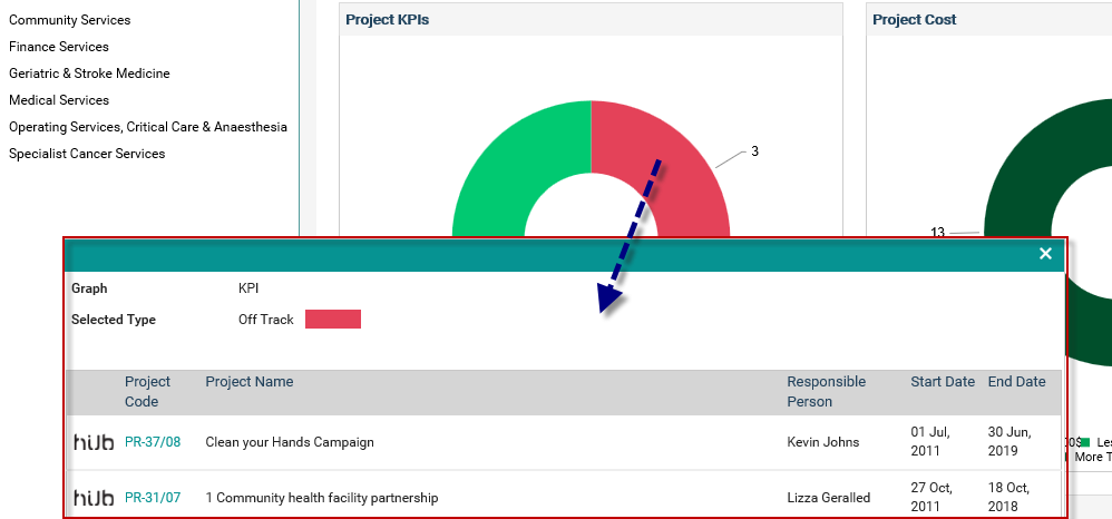
Project KPIs
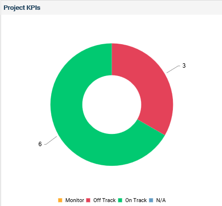
KPI performance is derived from the ‘KPI Object’
You can view the KPIs as a ‘Bar Chart’ or ‘Doughnut Chart’. You can set a relevant view by clicking on the ‘Edit’ icon. By default it will be shown as a doughnut chart.
In the bar chart, the X axis displays the Types (On Track, Off Track, Monitor etc.)
The Y Axis, indicates the percentage (or numbers, based on the selected filter options).
Click on a section of the widget to view more details (The projects categorised as per the selected type). A grid will be displayed. Selected graph name and section are displayed on top of the grid.
Project code is hyperlinked. Click on it navigate to the project detail object within the workflow in a new tab.
Click on the ‘Hub’ icon stated against a project to navigate to the hub area in a new tab. You will be navigated to the default hub area, which is configured via My Settings.
If the ‘KPIs’ object is not available in any of the project workflows, then the message “KPIs object is not configured in project workflows” will be displayed.
If the ‘KPIs’ object is available in project workflows and no KPIs are added in the ‘KPIs’ object, then the message “There are no KPIs linked to projects” will be displayed.
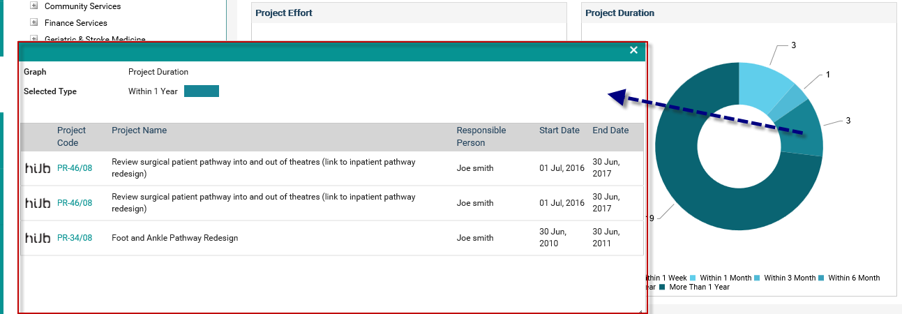
Project Duration
Project Duration widget displays the duration of the projects.
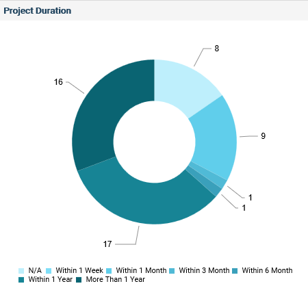
Project Duration is based on Start and End Dates (Timeframe field within the Project Details object) of the project. Holidays also will be included when calculating the project duration.
Projects are categorised as per the following durations:
§ More than 1 Year
§ Within 1 Year
§ Within 6 Months
§ Within 3 Months
§ Within 1 Month
§ Within 1 Week
§ N/A: Project duration is based on the Gantt. However, no tasks are available.
You can view the duration as a ‘Bar Chart’ or ‘Doughnut Chart’. You can set a relevant view by clicking on the ‘Edit’ icon. By default it will be shown as a doughnut chart.
In the bar chart, the X axis displays the Duration (More than 1 year, within 1 week etc.)
The Y Axis, indicates the percentage (or numbers, based on the selected filter options).
Project code is hyperlinked. Click on it navigate to the project detail object within the workflow in a new tab.
Click on the ‘Hub’ icon stated against a project to navigate to the hub area in a new tab. You will be navigated to the default hub area, which is configured via My Settings.
Project Cost
Project Cost widget displays the total expenditure of the projects.
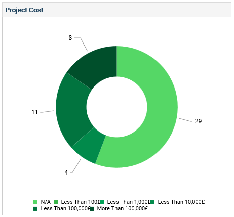
Project cost is derived from the ‘Total Expenditure’ budget type from within the ‘Preliminary Budget Object’.
Projects are categorised as per the following standard categories:
- Less than 100,000
- More than 100,000
- Less than 10,000
- Less than 1000
- Less than 100
- Not Available – No data for total expenditure in preliminary budget object.
You can view the cost as a ‘Bar Chart’ or ‘Doughnut Chart’. You can set a relevant view by clicking on the ‘Edit’ icon. By default, it will be shown as a doughnut chart.
In the bar chart, the X axis displays the Expenditure Categories (More 10, 000, Less than 100 etc.)
The Y Axis, indicates the percentage (or numbers, based on the selected filter options).
Click on a section of the widget to view more details (The projects categorised as per the selected type). A grid will be displayed. Selected graph name and section are displayed on top of the grid.
Click on the ‘Hub’ icon stated against a project to navigate to the hub area in a new tab. You will be navigated to the default hub area, which is configured via My Settings.
Project Total Effort
The Project Total Effort widget displays the total efforts for the projects.
Efforts will be derived from the total resource effort allocated for the project (in the Gantt area). However, ‘Holidays’ are excluded when calculation the total effort for the project.
Projects will be categorised as per the following standard effort categories:
- More than 1000 Hours
- Less than 1000 Hours
- Less than 500 Hours
- Less than 100 Hours
- Less than 10 Hours
- N/A: No resource allocation for the project (as per the Gantt)
You can view the total effort as a ‘Bar Chart’ or ‘Doughnut Chart’. You can set a relevant view by clicking on the ‘Edit’ icon. By default, it will be shown as a doughnut chart.
In the bar chart, the X axis displays the Effort Categories (More than 1000 Hours, Less than 10 Hours etc.)
The Y Axis, indicates the percentage (or numbers, based on the selected filter options).
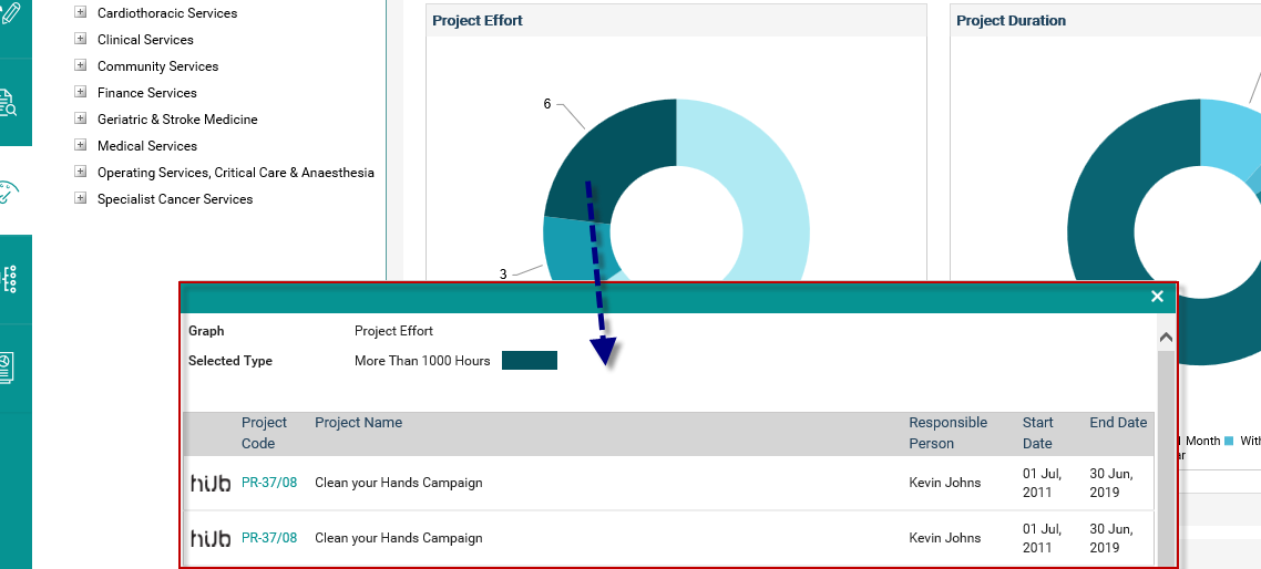
Click on a section of the widget to view more details (The projects categorised as per the selected type). A grid will be displayed. Selected graph name and section are displayed on top of the grid.
Project code is hyperlinked. Click on it navigate to the project detail object within the workflow in a new tab.
Click on the ‘Hub’ icon stated against a project to navigate to the hub area in a new tab. You will be navigated to the default hub area, which is configured via My Settings.
Copyright © 2014-2015 CAMMS Online Help. All rights reserved.
Last revised: July 26, 2017